Wednesday, July 28, 2010

CHAPTER TWENTY-FIVE– VALUE/COLOR CHART

Hacienda, 12" x 9"

In this experiment you’ll select a photograph to paint and make a chart of the values and colors to use for a painting. Find a photograph with good contrasting darks and lights and an excellent range of medium values, which make this experiment easier to do. Later you can go on to try it with moodier photos that contain less contrast. It can actually be a very good tool to use to help you decide on color variations in any value area.

Begin with a clear print of the photo in color, not grayscale, since this experiment will help you learn to determine the value of a color, as well has help you find other colors of the same or similar values to use in the course of the painting.

On a piece of clean white paper mark off a grid of approximately 2” squares, five across and five down. You can use any paper, but my experiment is done on a piece of white Wallis Pro grade paper. I find that making a chart on the paper I plan to use for the painting is most instructive.

Use a value finder, which you can hold over the colors to find the values. It’s easier to determine the darkest and lightest values, which is why you’ll do them first. Medium values are most challenging to sort out.

• Squint at the photograph and locate the darkest value in your photograph. Fill the bottom left square with a dark gray that matches that value.

• Find the lightest value and fill the top left square with a gray in that value.

• Decide on the next lightest value, which is medium-light, and add a gray in that value in the second square.

• Determine the next darkest value, which will be medium-dark of course, and fill a gray in the fourth square matching it.

• Find the medium value and fill the center left square with it.

**Hint: It might be useful to turn your board different directions as you fill in your squares to minimize the smear factor and the way dust drops down the page.

Check the values in your photograph carefully and make sure they’re found in the photo. Don’t use too black a dark if that value doesn’t exist there, or too white a light if it’s not that light. Remember that white has no matching color, since nothing is really as light as white.

Next to the value column record the color you see in the photograph. For instance, if a dark green tree is your darkest value and color, make a square of that dark green beside your darkest value square. If the sky is the lightest light, as it often is, place that pale blue in the second column next to the lightest value. You should then have a row of colors corresponding to each value that is derived from the real, natural colors seen in the photo.

This is the chart of colors I chose to use for the painting.
Can you picture all of them used simultaneously in the proper areas?
But to expand on your color choices, now add three more colors that match both of your first two selections in value. These need not be colors found in the photograph. Just match the values as a means of seeing that you could use them in the same place. For instance, beside your dark green you might put a very dark purple, a dark blue, and dark rust. Beside the light blue use pink, lavender or yellow. Repeat this for each row, choosing three other colors, so that you end up with a chart of colors matching each value. You should have a grayscale row, a row of real colors, and three rows of colors matching in value.

It’s advisable to set aside the pastel sticks you choose in order to make the painting with them.

Underdrawing
Now you have a chart that you can use for your painting. My challenge to you is to use all of the colors in the chart to make a painting. See how you can use combinations of pale yellow, green, pink and lavender to paint the sky, or all the variations of brown, red-violet, burnt umber, and blue-green to make the medium-dark areas, and so forth. It isn’t necessary to make the colors highly saturated or bright, as I often do. You can just as successfully paint a tonal piece with subtle color that is strong and lyrical in color.

I suggest you begin with a good underdrawing in charcoal on you toned Wallis paper. Record the values so that you become familiar with them and can match the colors in your chart to the value areas properly, but in  painterly fashion.

To find out whether the colors were close in value I made swatches, touching the colors to make a mass and squinting to see if the values were similar or not. You can see some colors that didn’t make the cut.


First layer of color


Here are the colors used in the first layer. The ones along the
bottom are extras, beyond the original palette of colors I chose.


One thing I should make clear is that you don’t need to stick to the original palette. Those colors are meant to inspire you to use adventurous color combinations. I often launch the painting using that palette, as I have here in the first layer, and then go on to add other significant colors where needed. Be careful not to destroy beautiful color layers by adding a flat layer of one color over the top, however.

Take your time and enjoy exploratory color. Leave evidence of layers. Let broken color shine independently, creating a visual mélange. You may choose strong, bold combinations or paint lyrical tonal variations, but no matter what you do, take some color risks to see where they will lead you.

A close-up of the colors used. Notice the layers in the building
and the more broken color in the tree.


Many colors make up the tree, which invited
broken strokes laid down side-by-side.


The grasses are massed together but show evidence of
layers of multiple colors.


TEST YOURSELF:


As a review, remember that you can determine the value of a color by laying swatches down so the colors are touching one another. For example, to find a value matching the gray stripe across the bottom, I’ve put several colors along it, just kissing the stripe.

I prefer to look at the pastels with my eyes to determine the values of the colors, rather than changing a photograph into a grayscale version (as I have done for you below for illustration purposes.) I find that there are too many variations on how to achieve the final grayscale version, not to mention the fact that determining the value of a color needs to be done visually, not mechanically, as you stand at the easel. It’s important to develop your ability to see the relative value of a color in its environment, whether that’s in nature, in your palette or amid your painting strokes.

Before looking at the grayscale sample below, decide for yourself which of these you think is the same or a very similar value. Squint to see if they become one with the stripe or not. (As much as I don't believe grayscaling the colors is particularly helpful when painting, I do believe you can learn about the application of value to color this way, so I've included a grayscale print.)


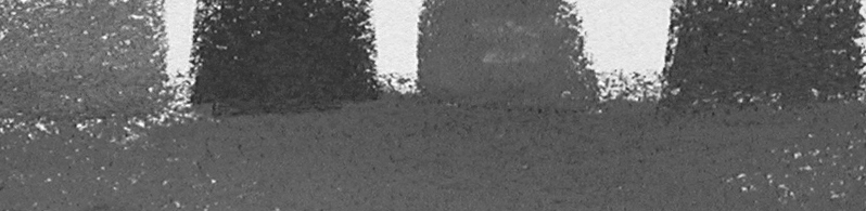
You can ree that the second color, the rust, is a little dark, and the fourth color, the greenish-yellow, is a hair darker, (if this grayscale is to be believed,) but both the magenta and orange closely equate to the value of the gray. Don’t be fooled by complementary colors or saturation when seeking values. Squint harder.

I believe you would be successful in combining all five of these colors in an area that’s medium in value, except possibly the rust, although I might be inclined to use it in an earlier stage to flavor the colors and subsequently cover it with the truer values.

Wednesday, July 21, 2010

CHAPTER TWENTY-FOUR -- MAKE A PUZZLE PAINTING

Waterfall, 18" x 12"

This experiment is meant to help you identify the value of a color and use multiple colors in any given value area.

First find a photograph that contains good contrast and a range of values that you would like to use for a painting. Make two black and white copies of it, enlarging them to about 8"x10”. If you’re able, blur one of the grayscale photos. If not, it won’t make any difference. Just be sure you have one clear grayscale print, and a second one that is either blurred or not. Blurring it sometimes simplifies the choice of value areas.


Cut the grayscale print into pieces. Use three, four or more value groupings. In other words, cut out the light sky shape, the medium-light shadowed cloud shapes, the dark tree shape (massed together), the medium mountain and the medium-dark ground plane. If there are smaller groupings within a value area, such as in the clouds, average this out by squinting at the picture or by placing it across the room to look at it. Find the average of the area. For instance, where there’s a tree against the sky, do not try to cut out every little light spot. Simply choose the dark value of the tree where it is dark and the light area of the sky as big shapes. Make as many value pieces as you need so that you have at least three or four puzzle pieces. You may have more than one puzzle piece in any value grouping -- for instance, you might have two medium-dark value pieces, one on each side of a road.

As you cut out the pieces reassemble them over the grayscale copy so that you can see where they belong. Lightly number each piece with a line pointing to that area in the grayscale photo, and then number the back of the cutout pieces to match. All this is meant to do is to help you reassemble the parts into a whole again.

Now remove the grayscale photo and arrange each of the cutouts into value order from light to dark. If you find pieces that are exactly or extremely near to the same value, group them together.

Take each value (or grouping of values) and prepare a clean, preferably white piece of drawing paper that will become the chart of colors you might use. Number them from one to five or six, depending on how many values you use.

Lay the hole in a value finder over the value shape cutout to find its value number from 2 to 9. Note the number of that value on your clean paper. * Note: There is no standard for numbering grayscales. Some will number white as 1 and some will number black as 1. Use whatever your value finder says and disregard others.

In good strong light on a separate piece of drawing paper find pastels that match this value. Lay down a swatch of the color and hold the value finder above it, then squint to see if it matches. Once you have found the matching value, note that color on the chart.

Have fun! Any color is okay. Try colors that often go unused. Think value, choose color. This is no longer a sky -- it‘s a light value. It’s not trees, but a chunk of dark colors. That’s no longer the ground but a harmony of medium colors. If you need to, turn the value shape cutout another direction so that it loses its identity as an object, such as trees, and can only be identified as a value.


You’ll know the values are exactly or almost exactly the same if, while squinting, they seem to blend into one larger shape. Look at the illustration above and notice how when you squint the blue centered in the hole and the gray surrounding it seem to merge into one. (If you can't see it, squint more.) Then mark the colors with the edges touching and you will quickly see if they are the same or very nearly the same value. As you can see in the mass of colors touching here, when you squint they become one larger shape, indicating their similarity in value.


It might be a good idea to lay aside the colors you have chosen from your palette so that you can easily find them again. You will be returning to these exact colors for your finished painting. It's helpful to make a chart for each value listing the value number and the colors, and lay out the pastel sticks on it. Do this for each of the value groupings in your painting. You should have three to six value charts. showing the color possibilities you might use in a painting of this image.


Now, looking at the original, whole grayscale photo, compare it with the charts you’ve made. Notice that you’ve selected many different colors of the correct value for each value grouping. Using only the grayscale photograph and your imagination (no pastel for now), envision a version of the image using different and varied colors. Imagine some different color possibilities for your painting. Take your time and think. This is valuable time and necessary to do.

Then using the grayscale photograph make three different sketches, loosely trying out different color layers to see just how the values work. Layer colors over one another or use broken color, putting them side by side in your painting. You don’t need to use every color in every painting, but remember that as you layer colors they will appear to be different depending on the last color applied. Perhaps it would help you to work in a format similar in size to the black and white copy. Paint quickly so that your brain doesn’t have time to demand “real” colors. Be playful, have fun, don’t let the finished product blackmail you into becoming colorless or vague. This is a color experiment! Find what is expressive and beautiful.

When you have completed your color sketches, select one to use as a basis for a larger, more finished painting using beautiful and expressive color.

(I apologize for not having any painting samples to show you from the above color choices, however here are some colorful paintings done using this method.)


Final Touches, 12" x 9"


Shadow Colors, 9" x 12"

Green at Pink Time, 9" x 17"


Tuesday, July 13, 2010

CHAPTER TWENTY-THREE -- FREE YOURSELF FROM THE PHOTO

Spring Canyon, 12" x 18"


Using a photograph as a source of inspiration can be a helpful tool, but as an artist you need to develop the strength to make decisions based on your creativity and ideas, and not become overly dependent on photos. Becoming a better artist is a lot like building muscle. You must make time to work out and improve, and try different exercises to become stronger. Training makes you fit, gives you confidence and allows you to try new and more difficult activities, which can result in new vision and creativity. Your artistic muscle improves when you exercise it independently.

A photograph can assist you in planning a painting. It can be a wellspring of information that helps you recall the place, time and object you’re painting accurately and helps you capture temporal elements not easily recalled. However, the same photograph can come to dominate a painting, slowly and subtly becoming the goal, sapping you of creative strength. Too often a photograph enslaves the unsuspecting painter to some degree of realism, detail or composition, and steals creative aspects. The artist can feel compelled to make the painting almost identical to the photo.

The eye sees differently than the camera. This difference shows in a painting done exclusively using the photo. When you stand in a location and look at a scene you tend to overlook the little things that lie close to you that a photograph will often include. The photo creates an “arm’s length” look to a place set off in the distance, like a postcard held in your hand. Another aspect derived from using different lenses is the tendency to have the same amount of detail from your feet to infinity or the horizon -- something only a photo can do -- or to have such a short focal length that everything in front of and behind the subject is a dreamy blur. Surely you’ve seen pieces painted using a photograph and clearly recognized that fact.
Many artists aren’t willing to abandon the use of photographs entirely, wanting to make credible paintings that include some aspects found in photos. So, how can you free yourself of over-dependence on the photograph? At what point does it cease to give strength and become a source of weakness? This point is different for each artist, but if you find the photo has begun to sap your power you might want to try a few exercises to help you limit its use as a resource.


Newly gained freedom from photos can often be disturbing, even a bit frightening. It seems safer to have a good photo that you can go back to over and over. However, the idea is to free yourself of this dependence and find the creative aspects of painting that will make you a stronger artist. You need to develop those artistic muscles. Begin by resolving to put the photograph away after completing a certain portion of the painting. Decide exactly how far you wish to go before setting it aside. You might choose to do a sketch, the underdrawing or one layer of color using the photo as reference.

You must put the photograph in a place where you can no longer see it if you’re to become free of its undue influence. When you reach the point of too much dependence, resolve to put the photograph completely out of sight. This means it’s not lying on your worktable a foot or so away where you can easily glance over at it. If that’s the case, eventually you’ll pick it up to see some aspect more closely and find yourself captured by it once again. Put it in a drawer or in another room, a place where you have to make a concerted effort to get it again.

Spend some time thinking about how far you really need to go with your reference photo in hand before going without. At what point in the process of your painting are you comfortable putting the photo away? (If you just said, "When it’s finished," you need these exercises!)

EXERCISES
One way to begin is to decide to use photos only for sketches. You can draw every detail and catch every nuance of the photograph as long as you know it’s only the beginning. Many artists find this system helpful because it works out the desire to draw what they see. After completing the initial sketch, you can begin to recompose elements, rearranging things to improve the composition in subsequent sketches. Once you arrive at a pleasing arrangement of shape, line and value, put the photograph in its hiding place and proceed with the painting, relying on your intuition and creativity to complete it. This usually results in a more original work that contains some of the virtues of the photograph.

Another possibility is to use the photo for the underdrawing only. This means that you might make decisions about composition, value and detail on your paper but not make any commitments to them without changing things. You can use the photo for certain aspects, then recompose before you begin putting down color. Rearrange the elements -- lower the horizon line, position an object lower or higher, or to the left or right, lighten or darken an area, mass things together differently. Whatever needs doing, do it now. Think of the drawing as your own, not a recreation of the photograph. Take possession of the place or object you’re painting. In some ways, you might find this a more independent way to compose, unlike making sketches and transferring the image to the paper. This method encourages you to loosen up in your approach to the whole painting process. Once you’ve determined what elements you want to use and where they reside, including details in certain areas, be sure that you put the photograph away. Try to think of the new image as being liberated from the photograph, an original place or item that’s solely yours.

Sometimes you’ll use one of the two methods above, and then as you begin to paint you’ll have a need to refer to the photograph again. You may need to retrieve a certain area of detail, perhaps the rocky face of a cliff at your focal point or the sheen of the water’s edge. In that case, try beginning with the photo, putting it away to recompose the drawing, and then retrieving it for the details before putting it out of sight again. This yo-yo effect works to begin to free you of the photo by assuring you when you’ve rearranged and established a clear composition and found the area of interest. You’re still able to retrieve the detail in areas where you need them. It may reassure you to know that you can freely compose and go back to your reference material later. Don’t fall into the habit of using the photo too often. If you’re tempted to pick up the picture and return to it as the final authority, this method may not be the best for you.

Another idea is to use the photo for the underdrawing, deciding on the light and dark masses of the painting, at which point you can choose colors based on the black and white values that are in place. Match the value of a color for the value in the drawing, disregarding the photographic color. This is a good idea if you’re fairly capable of understanding value and color and are not afraid of working without the aid of the photo. You’ll become free of overly photographic color and can begin with a lovely layer of playful color. If your goal is realism, you can achieve more realistic color in your subsequent layers, allowing the creative use of color to enhance realism’s lyrical quality.

Another possibility is to do the underdrawing and one layer of color, then put the photo away. This way you have the natural color in place, but are free of the photograph to add layers of creative, personal color. This will work if you’re able to think value when a color is in place, but will be difficult if you’re overly dependent on photographic color. For instance, once the green of the foliage is in place, you may find it difficult to put orange or purple over it. However, if you feel confident of color and are more comfortable with the colors of nature in place, begin with the green and let orange or purple work their magic. You still must free yourself of the photograph, allowing natural color to bow to your creativity.

If the photograph is so precious and beautiful that you cannot bear to depart from it, consider having it enlarged and framed, and don’t try to make a painting using it! Good photographs are seductive, urging you to copy every aspect. Instead, find a photograph that has some interesting elements, but one that you wouldn’t paint as it is. This will force you to recompose or recolor your painting. Bad photographs can make good paintings in the hands of an increasingly strong and original artist and can encourage creative risks that will likely improve your work. When you’re not enamored of the photo you might be inspired to make the painting look even better.

Is there ever a time when you should rely on the photograph throughout the entire course of a painting? Each artist must answer that question herself. However, think creatively and use different methods to see what will help you become stronger. As you become more confident of your ability to paint, rid yourself of dependence on the photograph. The ultimate independence comes when you no longer rely on the photo as a reference at all, instead reaching into your memory and experience to paint. Most artists have built more muscle than they realize and the act of painting solely by recall can reveal hidden strengths. Try painting your next piece without using any reference photo at all. Think about the place or objects you wish to paint, making a mental composition. Relax and let your mind and hand find the composition on your paper. You may be surprised in your ability to paint without any help from outside resources.

Building muscle is challenging but it results in new self-confidence. Knowing how much to rely on the photograph and when to let go can make more powerful paintings.


Soft Morning, 9" x 12"

Making a drawing, as I did above, can satisfy the desire to capture the details but free you to paint an image different from the photograph.


Sunstruck City
The resource photograph, shown above, is quite ordinary and uninspiring, except that it reminded me of the light that day. I used it to establish the mesas and shadows, then cut loose and recalled the color creatively.


Twilight Crossroads
Likewise a dull and fairly pedestrian photograph inspired me with a memory of shapes and light, but the color is all my own.


The paintings below were done entirely from my imagination, using no reference photograph at all.


Glow, 12" x18"

Boundary of the Day, 18" x 12"

Hillside series paintings.

Wednesday, July 7, 2010

CHAPTER TWENTY-TWO -- WHITE DONE RIGHT


Frosty Glow, 9" x 12" 


(With thanks to The Pastel Journal where this was originally published, with additional material included here.)

The painting looks washed out, as though someone poured bleach over it and left it in the sun too long. All the colors appear faded, like jeans after years of wear or an old flag left to disintegrate, a vague suggestion of once-bright colors. The overall effect is dull and flat. Chalkiness is a problem that can crop up in any medium, but is often found in pastel paintings, partly because of the abundance of pale colors that are available. The whitish, wishy-washy colors of a chalky painting suggest a lack of control over value, contrast and color.

A high-key painting need not be bland and characterless. Instead it can celebrate the light by maintaining control of tones, using a range of values and the right contrasts for the subject. Although the darkest dark may only be a medium value in the final painting it must nevertheless present a selection of values leading to the lightest light.

One way to defeat chalky color syndrome is to try two different challenges: First, paint an all-white subject using no actual white pastel. Second, paint a very high-key subject in which a medium value functions as the darkest dark. Each of these exercises will strengthen your understanding of how to control values while using colors. Value is the element that describes the shapes of objects and is the underlying abstraction of all painting, so increased awareness of value improves composition as well as color.

WHITE WITHOUT WHITE

Begin with an all-white subject, which may reside inside the composition, such as a white cloud or whitewater rapids, and work to create interesting colors hung on a sound tonal structure while maintaining a sense of whiteness. Because of the temptation to pick up pure, bright white, remove it from your palette and put it where you cannot see it. Good planning must lie behind your painting, in which you first create an arrangement of interesting values and shapes. In this challenge you need not limit the values. In fact, it’s best to design a strong tonal contrast of dark darks and an excellent range of middle values to use against the light colors to achieve the impression of whiteness. Don’t use bright white paper, which will simply allow you to replace the missing white with the color of the ground. Instead, choose a light value tone in a pleasing color to set the mood of the painting and establish its overall paleness. Do not allow the white subject to become simply black and white. Utilize colors to arrive at the proper tones. Many times an over-reliance on high contrast alone results in a chalky painting. Instead, a range of strong middle values accomplished via color will make an interesting all-white subject.

Cold River Runoff, 9" x 17"

How much color can you put into white? One of the most interesting aspects of white is that it’s made up of all colors in the light spectrum. Overlapping red, blue and green spotlights can make white light on a stage, as long as the colors are equally balanced. For the artist, this means white may be flavored with any color found in nature. Consider the color cast that varying light sources give to objects. Our sun is a yellow star and gives warmth to all colors seen in daylight. In shade, the blue of the sky influences all colors, so whites seen in daylight can generally be thought of as warm yellow in the sun and cool blue in shade. However, there are varying kinds of daylight. On an overcast day the light is often cool in color, having been filtered through clouds, while at sunrise or sunset the light is strikingly warm in color. Whites seen under these conditions can be darker shades of blue and green or warm, bright tones of red and orange. Moonlight, because it is so pale, bleeds all color from a scene, leaving ghostly grays in place of whites. Firelight and candlelight make white into hot red and orange. You’re free to select from an endless array of light colors because of the fact that white contains all colors.

One particularly important tool to have on hand is a value finder. While there are many varieties, essentially this is a card printed with a scale of grays from black to white, each of which is pierced with an opening. This allows you to hold the card above a color, squint until your eye is almost closed and see where that particular color blends into its value of gray. For instance, you can hold the card above a photograph of clouds and perceive the lightest lights in the white of the billows, as well as the paler grays of the blue of the sky. There is no standard number assigned to values on the value finder. The number 10 does not always represent white. In fact, 10 might easily be called black, so disregard the actual number but understand that there is a scale of dark to light.

White is by definition the lightest value in the palette. To paint white subject matter you must first realize that no other color can possibly approach white in lightness. Therefore the challenge is to build near-whites into the painting, using far more colors in the light range of your palette. Hold the value finder above the lightest values in your photograph or painting, noting that only white registers as the lightest light. Now find colors that are slightly -- very slightly -- darker than white. This may be only a pale pearl gray value. If your palette of colors is not strong in this light range, consider purchasing very pale blues, greens, yellows, peaches, pinks, lavenders and grays that you can use when very light values are needed. However, do not rely on light colors alone to make an effective painting of a white subject. You must structure a strong range of all values into the painting, and these too must be made using colors. Particularly important to the success of the white subject is the use of interesting middle tones, where the strongest color often resides. The strongest darks will also benefit from the use of colors.

To check the values of your colors change a photograph to grayscale on your computer. This will allow you to clearly see how the colors translate into values. Check to make sure that your subject appears to be white in the grayscale version and that you have the proper array of values.

MIDDLE VALUE AS DARK

For another challenge, paint a subject that’s structured using mostly lighter values, such as a very sunny landscape. This is commonly referred to as a high-key painting. Use your value finder to establish the darkest dark in your painting as a medium or medium-dark value. High-key compositions must have an interesting variety of values between the lightest light and the darkest dark to avoid overly pale chalkiness, even if the darkest color is medium in value. Rather than relying on high contrasts of light and dark, look instead to color relationships. This will necessitate concentrated contrasts in color rather than a reliance on value alone. However, no painting can possibly divorce itself entirely from the issue of value, which is a basic property of color.
Fog, 12" x 9"
You’ll need to select a value for your ground. Beginning with a middle value establishes the darkest tone for the entire painting. The test is to rely on medium values as the darkest darks in a painting of a light subject. It helps to create a careful study or underdrawing to establish a range of values from medium to light. In this painting you are allowed to use white for the palest value, however, after your experiments painting all-white-with-no-white you most likely will find that white seems somewhat dead, giving a ghostly chalkiness to the piece. The idea here is to use vibrant colors that bounce and play together, achieving an overall high-key value structure that’s nonetheless colorful. The effect may be one of intense heat, giving the impression of a hot summer day or powerful sunlight warming everything in the scene, even when predominantly cool colors are used, or may result in the cool, pale effect of fog or early morning light. Confirm your limited value range by laying your value finder down alongside the painting, or put a strong dark line next to the image against which you can check your colors so that you can more easily identify darks that are becoming too deep for the limited range you’ve established. Step back frequently to see that the intensity of colors you’re using approximates the light on the subject.

CONTROL

As you conduct each of these exercises your control over value will increase, as will your understanding of how to use colorful lights. You will begin to see the color of light in all its many hues, and realize that pale color does not mean lack of color. Chalky paintings with an insipid, dull look will soon give way to lyrical colors in pale values that vibrate together in a well-planned structure of values.

Sanctuary, 12" x 9"